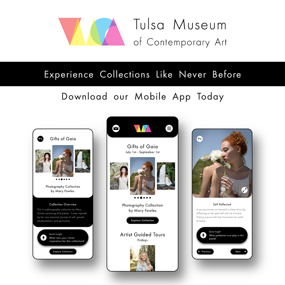
While this is a personal project, it was inspired by an editorial one. In that project I was provided with a logo to use for an artwork catalog, and the logo re-design inspired many subsequent projects.
Tulsa Museum of Contemporary Art


The Journey
This was the original logo provided by SNHU:

The artwork collections provided for the students to choose from gave me the impression that this museum would actually be a contemporary art one. In which case, I needed to design an abstract logo that was reminiscent of contemporary art. This led me to playing with layers, opacities, and bright colors. This was the result:

Rationale
The target audience for a contemporary art museum is young adults, educators, and art connoisseurs. This wide range of ages but general average being 19 to 35-year-olds led me to choose a bright color palette paired with black and white for high contrast. The goal of any medium or organization featuring artwork is to showcase the artwork and support it in taking center stage. This goal is what informed my decision to use a minimalistic brand style that puts the focal point on a bright object somewhere on the page. However, it also allows the logo to stand out, which promotes brand recognition.